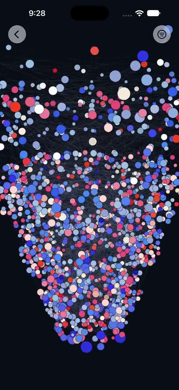
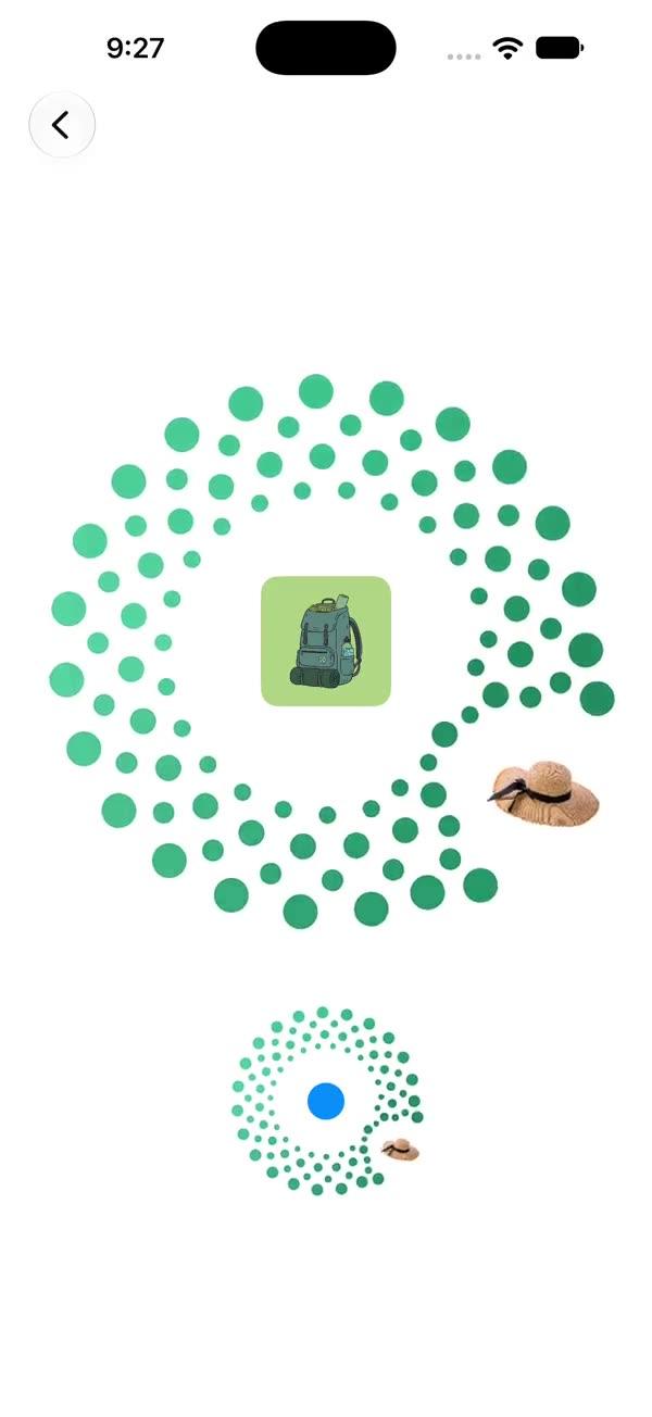
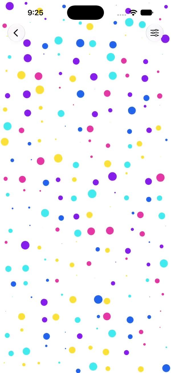
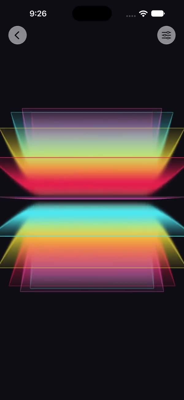
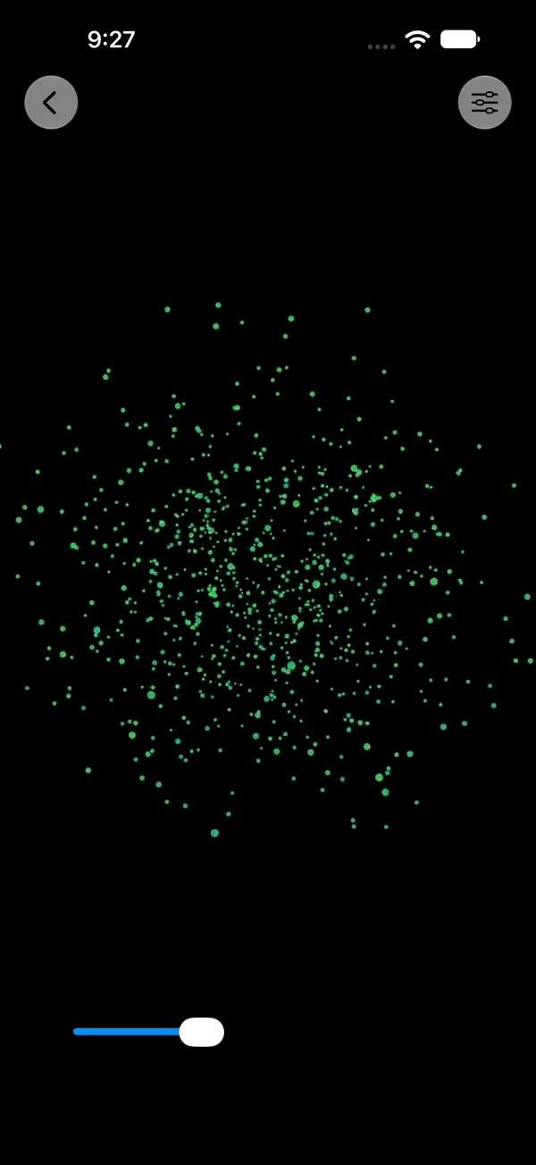
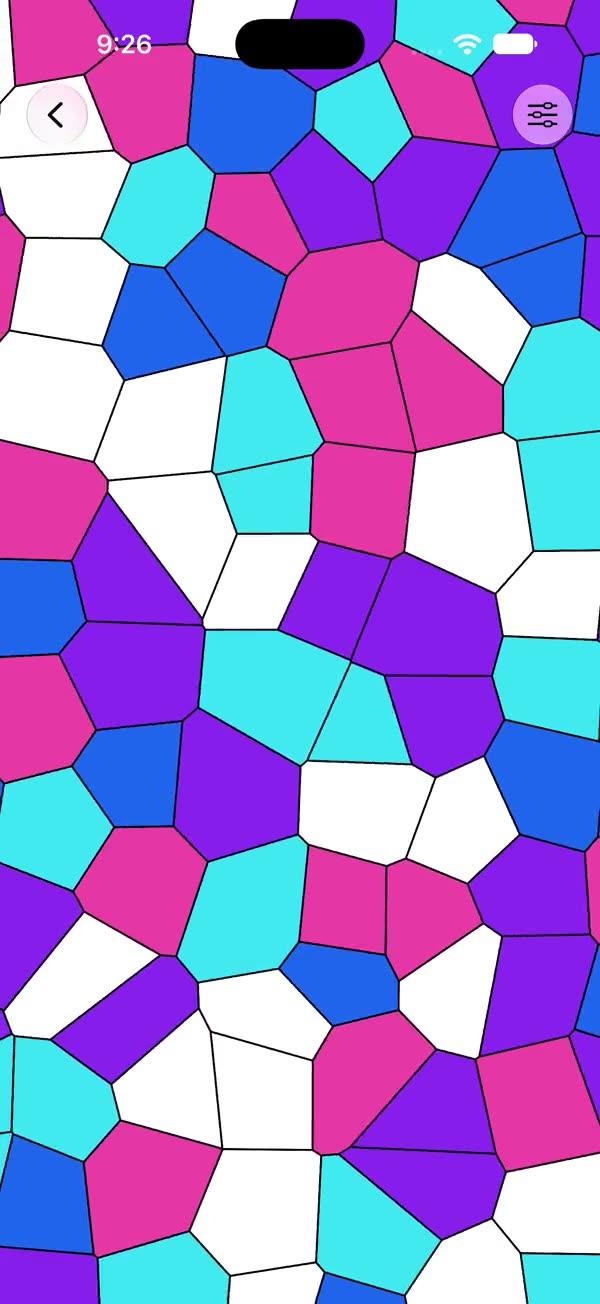
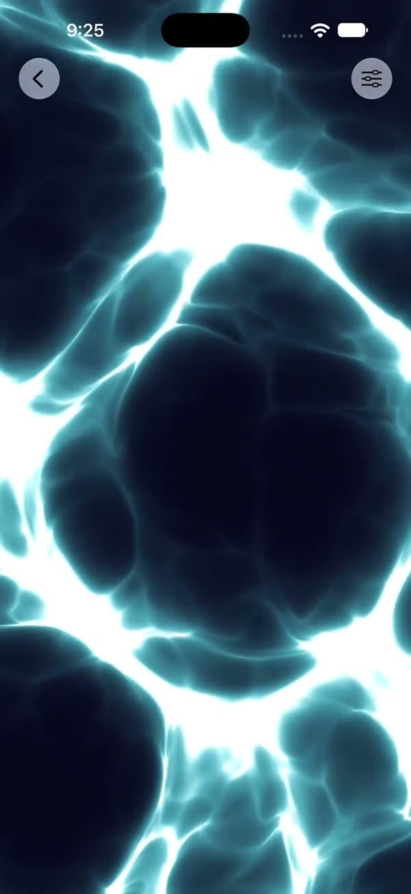
Animated Loop
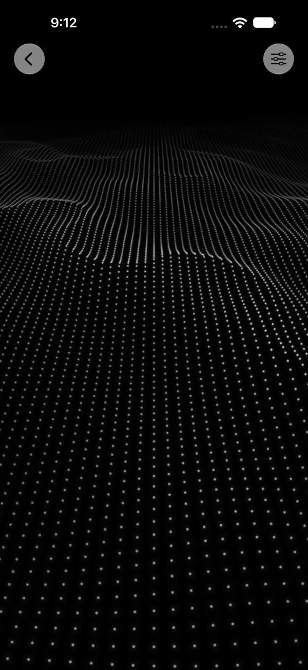
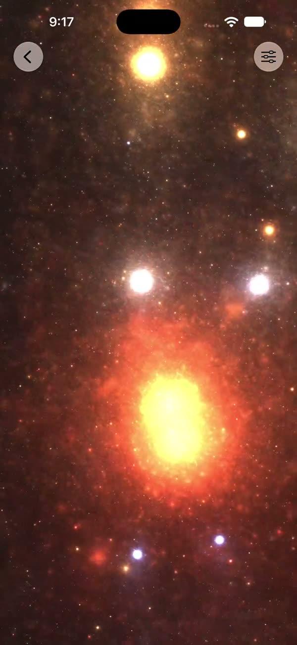
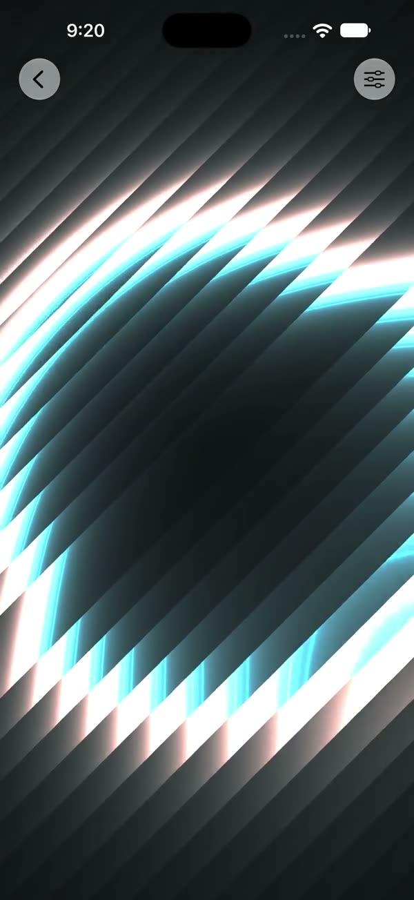
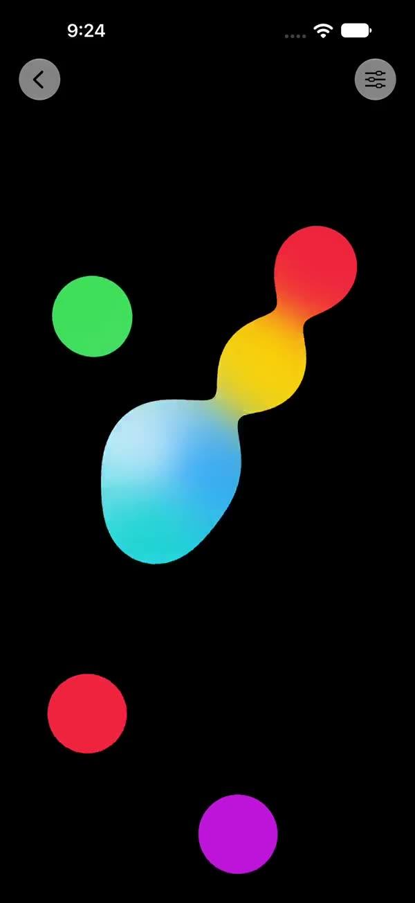
Pulsing concentric rings in one of four hand-tuned styles (Shape / Diamond / Neon / Warp) with three RGB-channel colors and per-channel phase offset — Shape style adds a geometric sub-picker (circle / square / diamond / hexagon / star)
Copies a short instruction with your private download link. Paste it into your agent: it downloads the whole skill (the source code, the setup steps and the mistakes we already made for you) and builds the screen.
Works with
What it does
Family of full-screen pulsing concentric-ring animations rendered through SwiftUI's colorEffect Metal pipeline. Four hand-tuned styles share the same per-line phase ramp, RGB-channel split, and additive composite logic; they only differ in the distance metric d and the pattern term m. The Shape style additionally exposes a 5-way geometric selector (circle / square / diamond pip / hexagon / star with petal count); the Neon style adds three angular-wobble parameters.
Requires iOS 18+ / macOS 15+.
What you get
- ✓834 lines of source code, ready to paste
- ✓File Layout
- ✓Source Code
- ✓Usage
- ✓Parameters
- ✓Integration Checklist
- ✓Notes / Gotchas
Usage
// Default — Shape style, circle, red/green/blue rings on black
ZStack {
    SWAnimatedLoop()
        .ignoresSafeArea()
}

// Switch styles — each style auto-loads its hand-tuned numeric defaults
SWAnimatedLoop(style: .diamond)
SWAnimatedLoop(style: .neon)
SWAnimatedLoop(style: .warp)

// Within Shape style, pick a geometric shape
SWAnimatedLoop(style: .shape, shape: .hexagon)
SWAnimatedLoop(style: .shape, shape: .star, petals: 7)

// As a section background
myContent
    .background { SWAnimatedLoop(style: .neon) }

// Brand-recolored — replace the RGB channels
SWAnimatedLoop(
    style: .warp,
    color1: .pink,
    color2: .cyan,
    color3: .yellow,
    background: .black
)
Parameters
| Parameter | Type | Default | Notes |
|---|---|---|---|
style | SWAnimatedLoopStyle | .shape | shape / diamond / neon / warp |
shape | SWAnimatedLoopShape | .circle | Style-specific — only honored when style == .shape; one of circle / square / diamond / hexagon / star |
petals | Int | 5 | Style-specific — only honored when style == .shape && shape == .star; range 3…12 |
color1, color2, color3 | Color | .red, .green, .blue | Three RGB channel colors, additively composited per-pixel |
background | Color | .black | Color rendered behind the rings |
speed | Float? | nil → style.numericDefaults.speed | Time multiplier on the ring sweep (style-specific default) |
lineWidth | Float? | nil → 0.002 | Per-ring line thickness |
lines | Int? | nil → style.numericDefaults.lines | Number of concentric rings (1…20) |
spacing | Float? | nil → style.numericDefaults.spacing | Distance multiplier between rings (0.5…20) |
channelOffset | Float? | nil → style.numericDefaults.channelOffset | Phase offset between RGB channels (-0.5…0.5) |
patternMod | Float? | nil → style.numericDefaults.patternMod | Period of the pattern term overlaid on the rings (0.01…2) |
rotation | Float | 0.0 | Rotation in radians (-π…π) |
scale | Float | 1.0 | Spatial scale (0.2…5) |
centerX, centerY | Float | 0.0, 0.0 | Ring origin offset (-1…1 each) |
angularLobes | Float | 3.0 | Style-specific — only used by Neon; integer lobe count for per-channel angular wobble (1…12) |
angularAmount | Float | 0.08 | Style-specific — only used by Neon; wobble amplitude (0…0.5) |
angularSpeed | Float | 0.5 | Style-specific — only used by Neon; wobble angular frequency (0…3) |
showsControls | Bool | false | Demo-only gear ToolbarItem; requires NavigationStack |
Style numeric defaults (loaded automatically):
| Style | speed | lineWidth | lines | spacing | channelOffset | patternMod |
|---|---|---|---|---|---|---|
shape | 0.05 | 0.002 | 5 | 5.0 | 0.01 | 0.20 |
diamond | 0.05 | 0.002 | 6 | 5.0 | 0.01 | 0.15 |
neon | 0.06 | 0.002 | 5 | 5.0 | 0.01 | 0.20 |
warp | 0.07 | 0.002 | 6 | 4.0 | 0.008 | 0.30 |
Integration Checklist
- Copy
SWAnimatedLoop.swiftandSWAnimatedLoop.metalinto your Xcode target. - Confirm the deployment target is iOS 18+ / macOS 15+.
- Pick a style —
SWAnimatedLoop(style: .warp)is a single line; each style ships with its author-tuned numeric defaults. - For the Shape style, additionally pick a geometric
shape:; for.star, optionally setpetals:. - For Neon, optionally tune
angularLobes/angularAmount/angularSpeedto control the per-channel wobble. - Replace
color1/color2/color3(and optionallybackground) for brand-aligned palettes.
Notes / Gotchas
- All four entry points take the same 18-parameter signature so the Swift renderer can use a single argument list and dispatch by name. Parameters that don't apply to a given style are explicitly cast away with
(void)x;to make "unused on purpose" decisions explicit in the shader source. - When
showsControlsistrue, the sheet's Style picker resets the numeric ring parameters (speed,lines,spacing,channelOffset,patternMod) to the new style's hand-tuned defaults — intentional, so each style ships with the look its author designed. - The Shape selector and Star petals slider are hidden in the sheet unless
style == .shape. The Angular section appears only forstyle == .neon. Parameters that don't apply to the current style are still passed to the shader but ignored there. - The Neon style applies a baked-in RGB boost
(1.1, 0.8, 1.2)after the additive composite — part of its style identity, do not parameterize. scaleandpatternModare both clamped internally to>= 0.0001so zero / negative input is safe.- The gear button is a native
ToolbarItem— the call site must be inside aNavigationStack.
More in Effects and animation