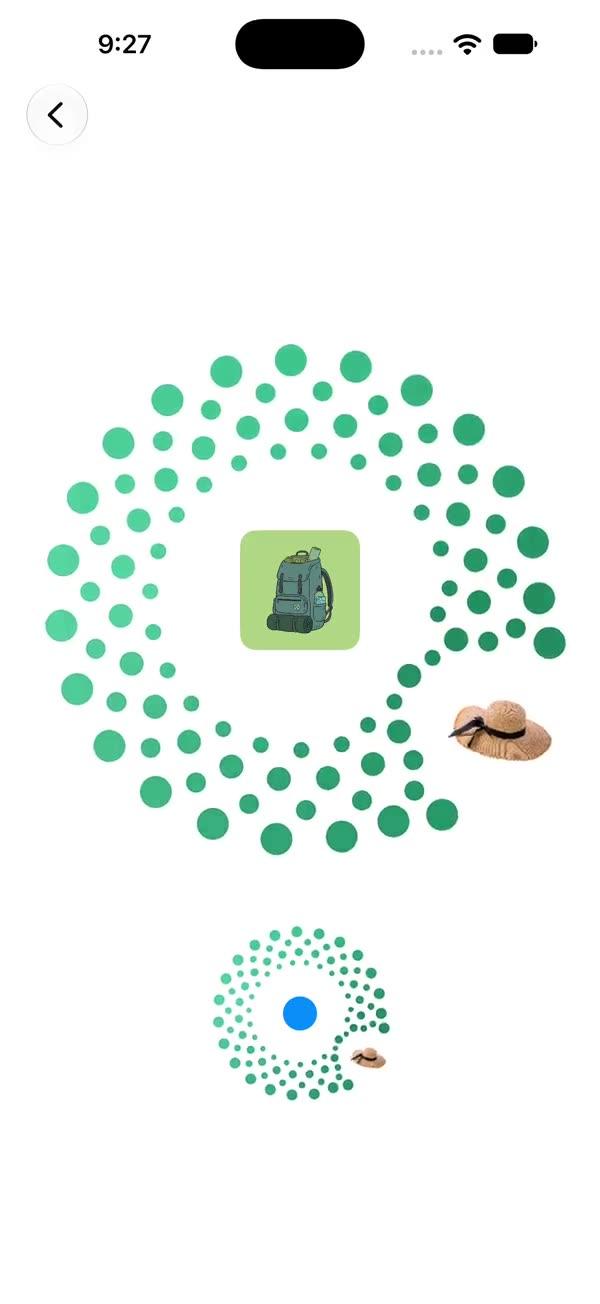
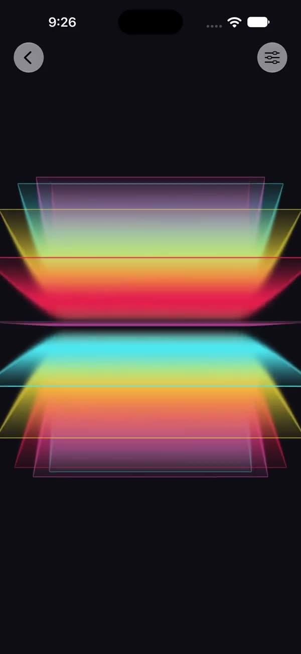
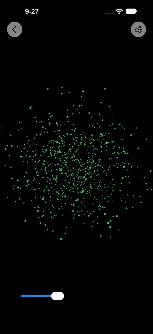
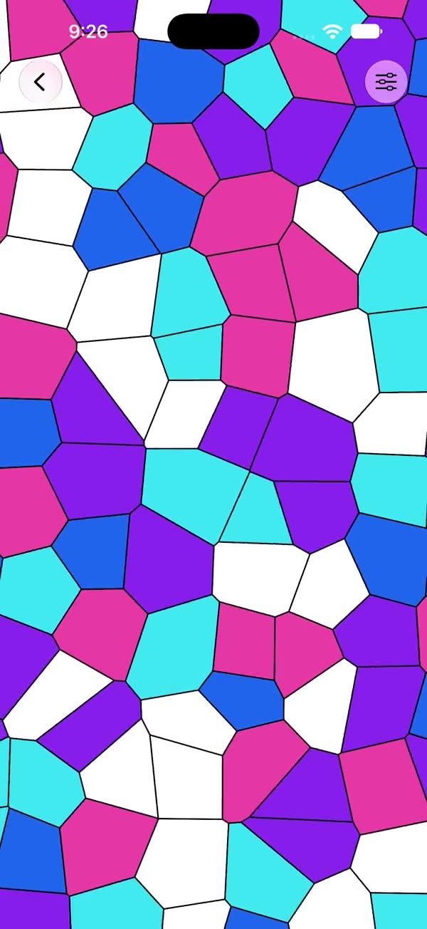
Full-Screen Button
Tappable card with Apple's native zoom transition (App Store / Photos style) — the card geometry-matches into a true full-screen view via iOS 18 `.matchedTransitionSource` and `.navigationTransition(.zoom)`
Copies a short instruction with your private download link. Paste it into your agent: it downloads the whole skill (the source code, the setup steps and the mistakes we already made for you) and builds the screen.
Works with
What it does
Tappable card that expands to fill the device display using Apple's native zoom transition — the same continuous, geometry-matched effect Apple uses for App Store / Photos / Music album-to-detail navigations. The compact card appears to spring into the entire screen rather than sliding up as a generic modal, and because the expanded view is pushed onto the host NavigationStack, it covers the screen edge-to-edge regardless of the surrounding ScrollView / VStack / nested layout.
Requires:
- iOS 18+ (uses
.matchedTransitionSource(id:in:)and.navigationTransition(.zoom(sourceID:in:))) - An enclosing
NavigationStack— the component pushes its expanded view onto the host stack - An
AccentColorcolor set in your asset catalog — the footer uses Xcode's generated.accentasset symbol (Xcode's default app template already includes one)
iOS only. File is named SWFullScreenButton+iOS.swift; in Xcode → Build Phases → Compile Sources set the platform filter for this file to iOS.
What you get
- ✓182 lines of source code, ready to paste
- ✓Source Code
- ✓Usage
- ✓Parameters
- ✓Notes
Usage
// Must be hosted inside a NavigationStack
NavigationStack {
    SWFullScreenButton()
}

// Custom copy
NavigationStack {
    SWFullScreenButton(
        title: "SmileMax",
        subtitle: "Daily smile analytics",
        footer: "Open"
    )
}

// Custom palette and shape
NavigationStack {
    SWFullScreenButton(
        gradientColors: [.purple, .pink],
        cornerRadius: 24
    )
}
Parameters
| Parameter | Type | Default | Description |
|---|---|---|---|
title | String | "ShipSwift" | Top headline shown in white |
subtitle | String | "Fullstack AI toolkit" | Single-line tagline under the title |
footer | String | "FullScreenCard" | Bottom accent label rendered with the accent color |
compactSize | CGSize | CGSize(width: 300, height: 300) | Frame size in the collapsed state |
gradientColors | [Color] | [.brown, .white] | Background gradient stops, applied top to bottom |
cornerRadius | CGFloat | 30 | Card corner radius applied in the compact state |
Notes
- Why the zoom transition? An earlier version of this component animated its own
.framefromcompactSizeup toUIScreenbounds withwithAnimation(.bouncy). The bounce was the entire point of the component — but inside anyNavigationStackorScrollView, SwiftUI's layout system clamped the frame to the parent's content area, so the card grew toward the toolbar / scroll bounds and never reached the physical screen edges. A second iteration switched to.fullScreenCover, which fixed the "fills the screen" problem but threw away the original spring-into-fullscreen feel —.fullScreenCover's generic slide-up modal is something any vanilla SwiftUI app gets for free, so the component became redundant. The iOS 18 zoom transition gives back the best of both: a continuous, geometry-matched spring from the compact card into a real edge-to-edge view, with no manual screen-size measurement and no container clamping.
- Dismiss gestures. The expanded view supports two dismiss paths: (1) tap anywhere on the card — the destination view holds
@Environment(\.dismiss)and calls it ononTapGesture, which pops theNavigationStackand triggers the reverse zoom animation; (2) edge-swipe-back — the system-provided gesture for any pushed view, also reverse-zooms. The tap path matches the original "tap to toggle" intent of the component; the edge-swipe path is iOS-native muscle memory.
- Why
NavigationStackis required. The zoom transition is implemented as aNavigationLinkpush with a.navigationTransition(.zoom(...))modifier on the destination. Without a hostNavigationStack, theNavigationLinksilently renders as a plain button and the transition never fires. The hosting requirement is what lets the zoom escape anyScrollView/ nestedVStack— the push goes through the stack, not through the layout tree.
- iOS 18+ only. Both
.matchedTransitionSource(id:in:)and.navigationTransition(.zoom(sourceID:in:))were introduced in iOS 18, ShipSwift's minimum, so no@availableannotation is needed. The file is namedSWFullScreenButton+iOS.swiftso Xcode's per-file platform filter can exclude it from macOS targets — do not wrap the body in#if os(iOS)as a substitute (per the ShipSwift convention, platform filtering is a build setting).
- Tap target. The whole compact card is the
NavigationLinklabel;.buttonStyle(.plain)removes the default tint so the gradient renders cleanly.
- Shadow flicker on reverse zoom — the real fix. The iOS 18 zoom transition snapshots the source view's bounds raster. A
.shadow(_:)is drawn outside those bounds, so the snapshot never carries it — regardless of whether the shadow is written as a trailing modifier (.shadow(radius: 30)) or embedded inside a.background { RoundedRectangle().shadow(...) }. The visible symptom: during the reverse zoom the shadow is absent, and one frame after the system hands off from the destination snapshot back to the live source view, the shadow "pops in." We solve this with an animated radius: a@State private var shadowRadius: CGFloat = 30drives the background's shadow, the destination's.onAppearsets it to0, and.onDisappearrunswithAnimation(.easeOut(duration: 0.25)) { shadowRadius = 30 }. Reverse zoom completes withshadowRadius == 0, then the shadow fades back in smoothly — masking the snapshot hand-off frame. This is the only reliable fix on iOS 18;.compositingGroup(),.drawingGroup(), and reordering the modifiers do not extend the snapshot bounds.
More in Effects and animation